Salesforce is an excellent CRM — but when it comes to advanced Salesforce dashboards, most revenue leaders quickly hit limits.
Native Salesforce reports are fine for basic pipeline visibility. But CROs, CFOs, and RevOps teams need more than static charts. They need dashboards that answer questions like:
Are we on track — or drifting?
How reliable is the forecast?
Where is execution breaking down?
Which teams need attention now, not next quarter?
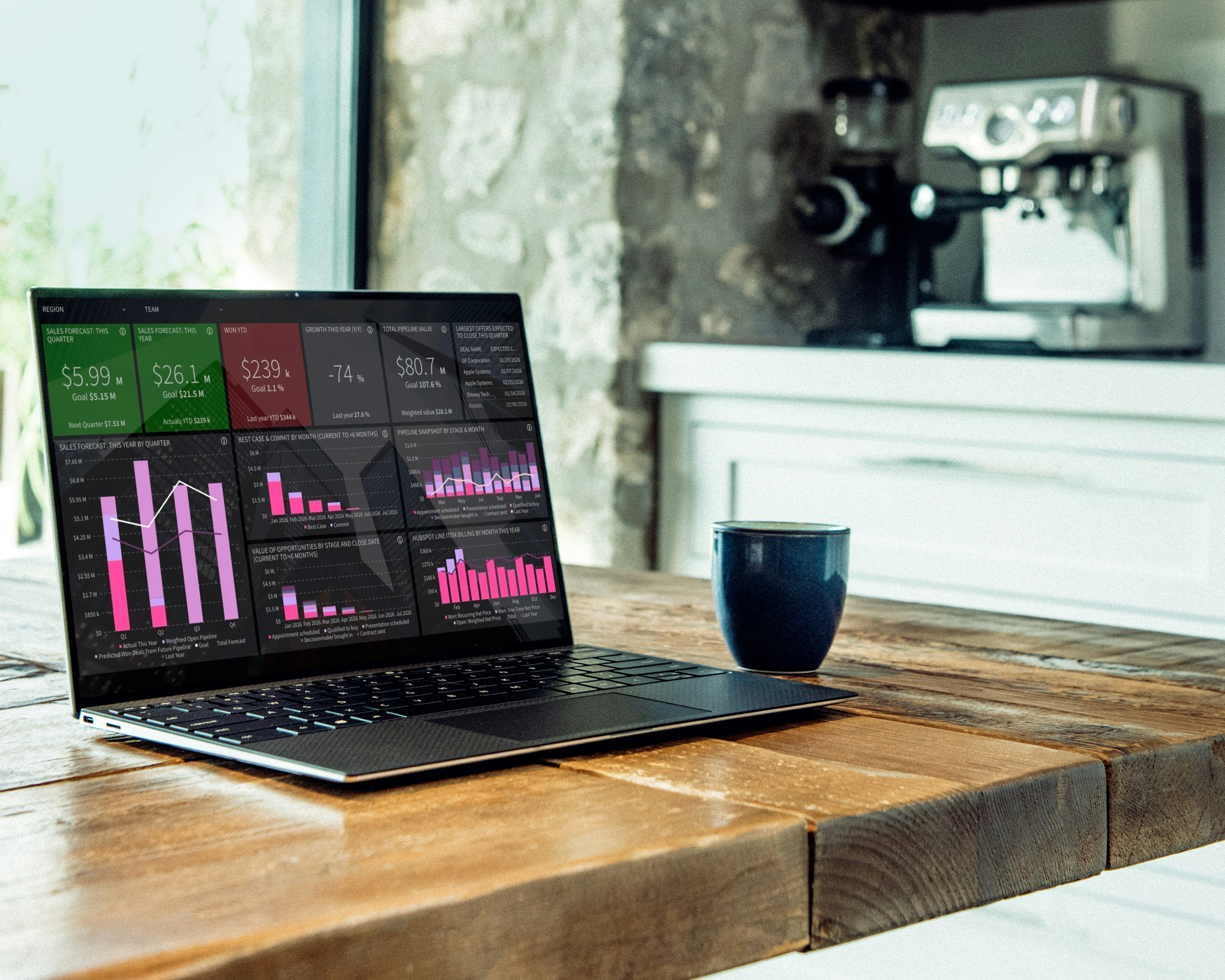
That’s why advanced Salesforce dashboards have become a core operating layer for modern revenue teams — especially when they’re embedded directly inside Salesforce.
In this post, we’ll:
Briefly outline the limitations of Salesforce’s native reporting
Show the small set of advanced Salesforce dashboards sales leaders actually use
Explain how teams build these dashboards in minutes, not months
Limitations in Salesforce’s Native Reporting Capabilities
Salesforce’s native reporting capabilities are adequate for simple reporting needs, but they do have some limitations that users frequently encounter. Some of the most common limitations include:
Limited Cross-Object Reporting
Native Salesforce reports are primarily designed to pull data from a single object at a time. If you need to report across multiple objects (e.g., accounts, contacts, opportunities), it’s challenging without using complex relationships like “report types” or custom objects.
No Support for Hierarchical Reporting
Salesforce struggles with more complex hierarchical reporting, where you need to easily view data in a tree-like or multi-level format. The native reporting capabilities aren’t as intuitive or powerful for visualizing hierarchical data (like parent-child relationships) compared to specialized reporting tools.
Limited Target-Setting and Tracking Functionality
Salesforce’s native goal-setting features work well for tracking performance against predefined sales targets, but the functionality is somewhat limited when it comes to flexibility, complexity, and cross-departmental alignment. For companies that need more advanced goal-setting features (like complex calculations, targets for a variety of sales activities or pipeline metrics, or tracking goals throughout all levels of the sales organization), a third-party tool might be necessary.
Restrictive Data Visualization Options
The out-of-the-box visualizations in Salesforce reports are fairly basic. While Salesforce does offer charts within reports, the customization and design options for visuals are relatively limited compared to more specialized Salesforce reporting tools.
Lack of Advanced Customization
Although Salesforce provides a range of report formats (Tabular, Summary, Matrix, and Joined reports), customizing the appearance and layout of reports is often limited. Users can’t, for example, fully customize how fields and values appear or change the design as extensively as some other reporting tools would allow.
5 Advanced Salesforce Dashboards Revenue Leaders Actually Use
Modern sales leaders don’t use dozens of dashboards. They rely on a small number of trusted Salesforce dashboards that run forecast calls, reviews, and board discussions.
Below are the five advanced Salesforce dashboards we see used most consistently by CROs and RevOps teams.
1. Executive Revenue Overview Dashboard
This is the dashboard leadership runs the business from.
It answers, in one view:
Target vs actual revenue
Forecast vs goal
Clear on-track / off-track signals
Visibility across regions, teams, or business units
This is not a reporting dashboard. It’s an operating dashboard.
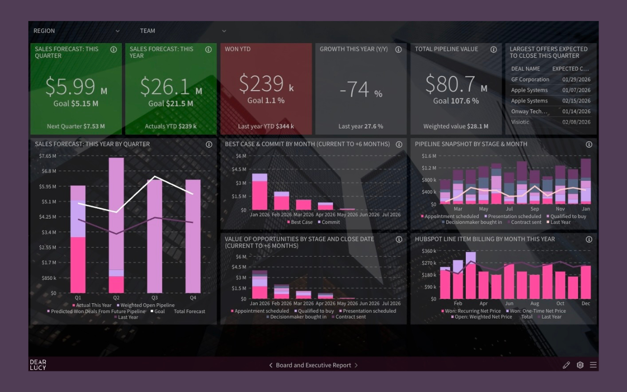
Executive Salesforce dashboard used in forecast calls and board reviews — one revenue view leadership can trust.
Salesforce dashboards sales leaders actually use
2. Salesforce Forecast Accuracy Dashboard
Most Salesforce forecasts fail when leaders stop trusting the number.
This dashboard shows:
Forecast vs actual deviation
Accuracy trends over time
Bias (over-forecasting vs sandbagging)
Where confidence is earned — or lost
Forecasting without accuracy tracking is just opinion.
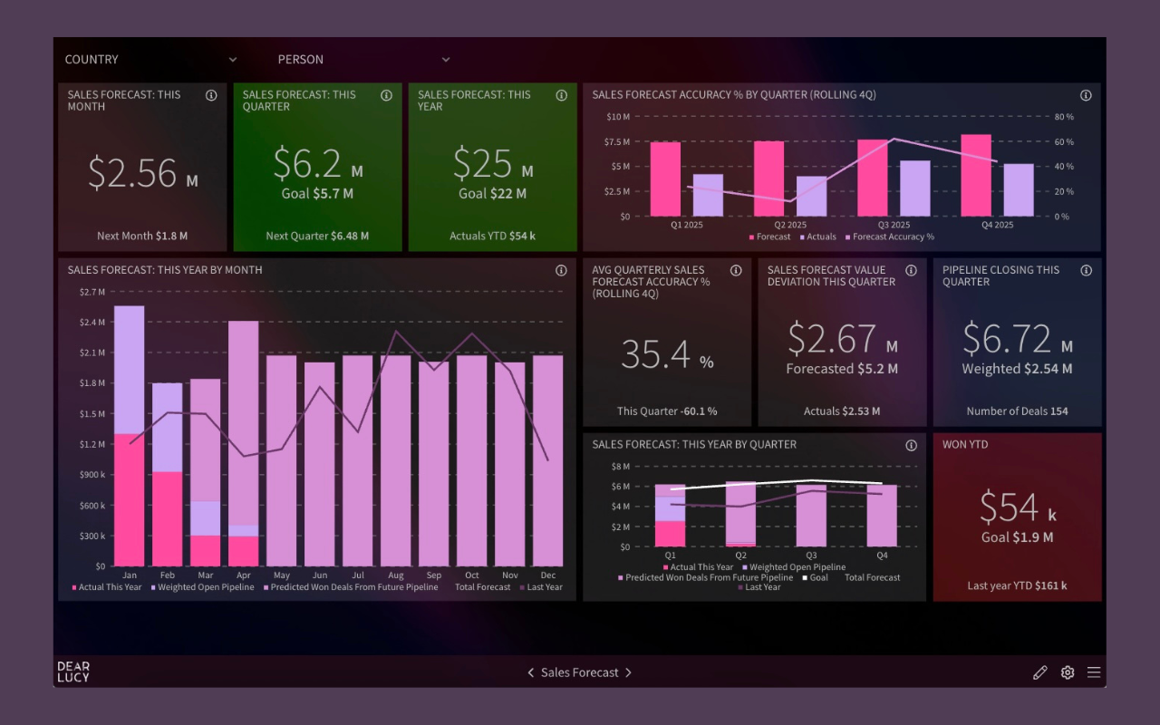
Salesforce forecast accuracy dashboard tracking forecast reliability week by week.
3. Goal Pacing Dashboard (Quota + Leading Indicators)
Hitting quota isn’t the problem.
Knowing early whether you’re converging on it is.
Modern Salesforce dashboards pace:
Revenue targets
Pipeline creation
Pipeline coverage
Activity metrics that actually correlate with outcomes
This allows teams to course-correct while there’s still time to act.
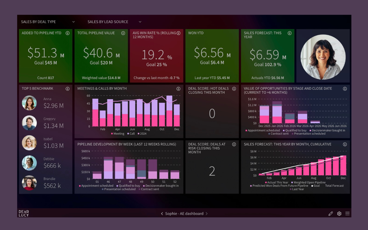
Salesforce goal pacing dashboard showing execution against targets in real time.
4. Pipeline & Deal Risk Dashboard
Sales leaders need to see risk before it hits the forecast.
Advanced Salesforce dashboards surface:
Aging opportunities
Stalled deals
Stage congestion
Close date drift
This turns pipeline reviews from storytelling into decision-making.
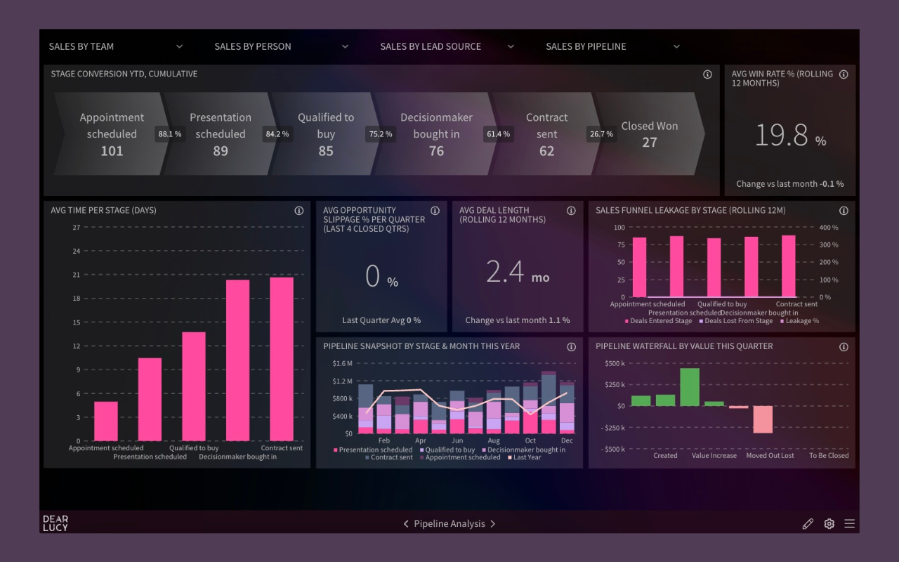
Salesforce pipeline analysis dashboard highlighting conversion and execution risk.
5. CRM Data Hygiene Dashboard (“The Wall of Shame”)
Forecast accuracy, goal pacing, and pipeline health all depend on one thing:
CRM data quality.
This dashboard makes data hygiene impossible to ignore:
Missing close dates
Stalled deals
Overdue activities
Ownership by rep and team
It’s not a technical report.
It’s a behavioral signal.
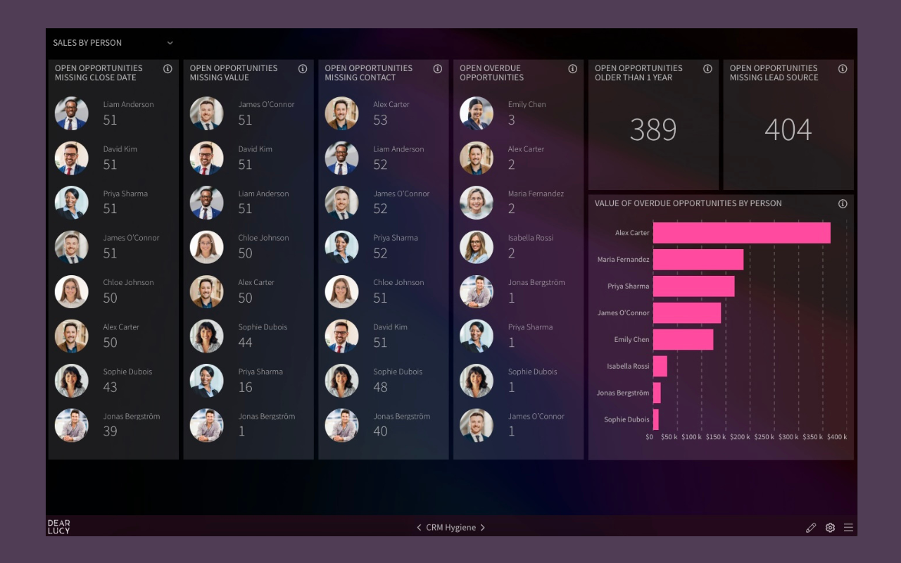
CRM data hygiene dashboard exposing execution risk and forecast erosion.
CRM data hygiene in Salesforce
For more example Salesforce dashboards, check out out interactive dashboard gallery.
How to Create Advance Salesforce Reports in Minutes with Dear Lucy
Getting access to all of the aforementioned advanced Salesforce dashboards — and more — is easy. Here are the steps you can follow to get started:
Connect your Salesforce data to Dear Lucy in one click.
Your data will automatically populate into our most popular dashboard templates.
Once your data is flowing into Dear Lucy, you can easily embed any dashboards you want into Salesforce with a few clicks.
If you’d like to see example reports before connecting your own data, you can click through our gallery of interactive sales dashboards or schedule time with one of our product experts.
Get advanced Salesforce dashboards in minutes
Sign up for your free 10-day trial of Dear Lucy today. Connecting your data only takes one click, and our example dashboards will start populating with your data immediately.