
If your sales team lives in Pipedrive, but still uses spreadsheets or manual reports to understand performance, you're not alone. Native Pipedrive dashboards offer a start, but scaling sales teams quickly run into limitations.
In this guide, we’ll show how to move beyond static charts and build live, actionable Pipedrive dashboards that drive results — using Dear Lucy.
Why Dashboards Matter in Pipedrive
Great dashboards turn data into action. In sales, that means:
Reps know what to focus on today
Managers know who needs help
Leaders know if they're on track to hit targets
Pipedrive offers some dashboard functionality inside Insights, but it's limited to basic charts. As your needs grow, gaps start to appear.
Common Frustrations with Native Pipedrive Dashboards
Pipedrive's Insights and dashboards are good for individual views, but less helpful when you want:
Custom filters (e.g. by market, product, or deal type)
Multiple pipelines or business units in one view
Forecast dashboards based on real-time pipeline scoring
Recurring revenue dashboards for MRR/ARR tracking
Goal pacing to see if you're on track
And for most users, even small changes mean manual spreadsheet work.
A Better Way to Build Pipedrive Dashboards
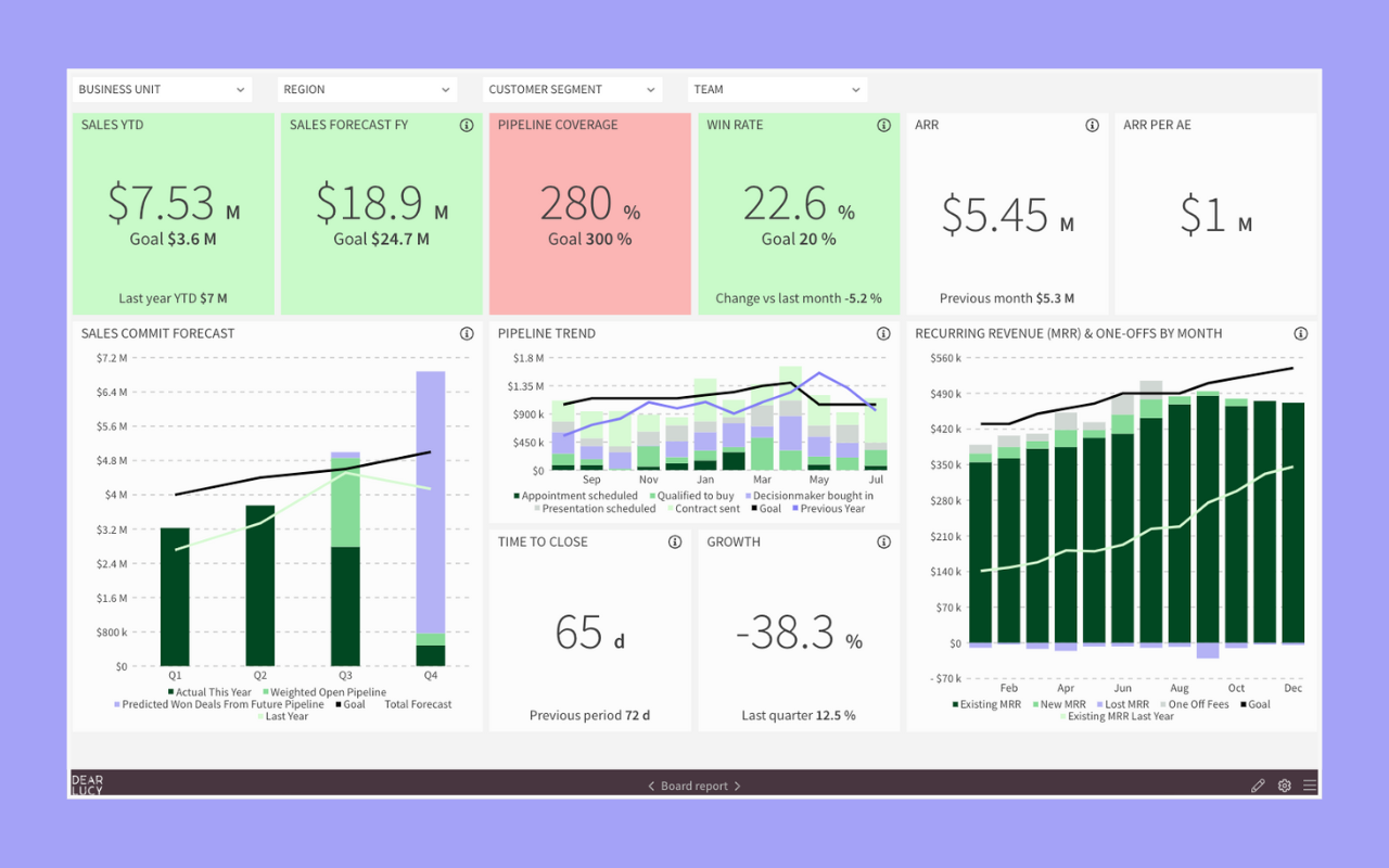
Dear Lucy gives you fully automated dashboards for sales, forecasting, performance coaching, and revenue operations — all powered by your Pipedrive CRM data.
With Dear Lucy, you can:
🔹 Build custom Pipedrive dashboards by rep, team, product, or market
🔹 Show key KPIs like pipeline value, win rate, velocity, forecasts, and more
🔹 Segment by region, deal type, product line, or business unit
🔹 Track goals vs performance in real time
🔹 Visualize stage conversions and pipeline health
🔹 Get automatic pacing alerts and leaderboard updates
And the best part? Everything stays up to date. No exporting. No spreadsheet hacks.
Example: Pipedrive Dashboards by Team & Region
Let’s say you manage 3 sales teams: North America, EMEA, and APAC. You want to:
Compare pipeline coverage and forecast accuracy across teams
Track team-level goal progress vs monthly targets
Spot early underperformance to intervene
With Dear Lucy:
You get dashboards filtered by region or team
See pacing against goals in real time
Drill into team or individual rep performance instantly
No spreadsheet stitching. Just one clean dashboard.
Why It Works
Dear Lucy isn’t a reporting tool. It’s a performance layer that makes your Pipedrive data useful.
That means:
Sales reps see what matters most
Managers coach smarter
Leaders drive results with clarity
And you can connect it in minutes.
Explore More
Looking to do more with your Pipedrive data? Check out our other guides: